The seemingly impossible is possible. We can have a good world.
--Hans Rosling
In case you haven't already come across this:
Hans Rosling, a Swedish Doctor and International Health Professor, made a tremendously interesting presentation to the 2006 TED Talks conference on the relationship between public health and economic development:
It's data-rich but uses excellent visualizations to demonstrate that:
Global economic and health indicators no longer follow the us/them dichotomy of the early postwar era, but rather (nearly) all countries are moving toward higher GDP per capita, longer lifespans and smaller families; and
Investing in public health is much better for a country's long-term economic growth.
Rosling did a follow-up presentation at the 2007 TED Talks conference that went into more detail on the comparative rates of development of emerging economies vs. industrialized economies.
That is, the developing countries are actually developing more quickly in economy, public health and governance than the industrialized countries did.
For example, he undertakes a spirited defence of the progress of African countries, pointing out that their rates of development has been remarkable compared to the rates of growth of the industrialized countries to which they are compared.
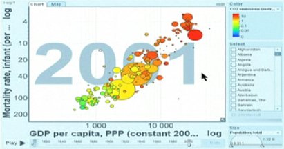
He also compares economic growth over time with carbon emissions per capita, demonstrating that they are closely coupled: so far, per capita economic growth correlates very closely with per capita emissions. Rosling notes, "This needs to change."

GHG Emissions per Capita by Country
One of the most remarkable aspects of Rosling's project has been to take formerly inaccessible UN data and create an open web-based interface that the public can now search:
This is just fascinating stuff!
By JonC (registered) | Posted March 03, 2009 at 15:44:05
The graph provided is GDP per capita versus infant mortality, which is misleading.
The rate of power consumption appears to correlate just as well as GHG emissions (if not better). What really needs to change is an unsustainable rate of consumption. If anyone plays around with the site, what's most concerning (for me) is the giant circles for India and China climbing along the consumption curves over time (throw up a GHG versus electrical consumption (both on log scales) and move the slider around on the year). The current level of consumption isn't working and it's not going to be any better if everyone wants to waste as much power as Canadians do.
You must be logged in to comment.
There are no upcoming events right now.
Why not post one?